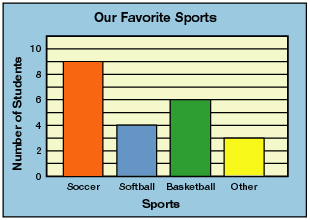
Over the last month we have been learning various components of Data Management and Probability. This week you learned how to collect and organize discrete primary data by creating a questionnaire whereby you asked your fellow classmates a question and provided them with five possible choices to choose from. This was then followed by you displaying the data in the form of a bar graph. As I look through your bar graphs, I am pleased to say that you all followed my instructions and example on the board. Each graph was labeled appropriately at the top, x and y axis, each bar was color coded to differentiate their meaning, and each bar was labeled according to what it represented. Furthermore, the topics that you all chose varied. Some students asked their classmates about their favourite ice cream flavour, food, animal, colour, sports team, sport and so forth. Due to the accuracy of the data you collected and graphed, I have decided that the information will be used in our next math lesson where you will learn how to display data through a stem-and-leaf plot graph.
Great job students I am very proud of your work!
No comments:
Post a Comment